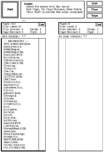
If full vector graphics and the custom hardware needed for systems like NLS/Augment was too expensive for general use, character VDTs were too crude. Today's nethack(6) game, run on a color terminal emulator or console, is well representative of the best that advanced VDTs of the late 1970s could do. They hinted at what was possible in visual-interface design, but proved inadequate themselves.
There were several reasons character VDTs came up short that bear on issues still relevant to today's UI designers. One problem was the absence of an input device that was well matched to the graphics display capability; several early attempts, such as light pens, graphic tablets, and even joysticks, proved unsatisfactory. Another was that it proved difficult to push enough bits per second over the line to do serious graphics. Even after VDTs acquired the capability to write pixels as well as formed characters, running GUIs on them remained impractical because serial lines had a peak throughput far too low to support frequent screen repainting.
For reasonable update speed, graphics displays really need to be coupled more closely to the machine that is doing the rendering than a serial connection will allow. This is especially true if one needs to support the kind of high interactivity and frequently changing displays characteristic of games or GUIs; for this, only direct memory access will do. Thus, the invention of the GUI had to wait until developments in silicon integrated circuits dropped the cost of computing power enough that a capable processor could be associated with each display, and the combination had become sufficiently inexpensive that machines could be dedicated to individuals' use.
The other missing piece was Engelbart's invention of the mouse — and, just as significantly, the visible mouse pointer. This more controllable inversion of the large, crude early trackballs meant that users could have a repertoire of two-dimensional input gestures to match the two-dimensional screen. It made interfaces based on direct visual manipulation of objects on-screen feasible for the first time.
Figure 2.4. The Xerox Alto.
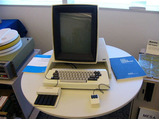
The input device on the left appears to be a touch tablet, a mouse alternative similar to the trackpads on modern portables.
NLS/Augment had shown what was possible, but the engineering tradition behind today's GUIs was born at the Xerox Palo Alto Research Center (PARC) around the same time character-cell VDTs were becoming generally available in the rest of the world. Inspired by Engelbart's 1968 demo, in 1973 the PARC researchers built a pioneering machine called the Alto that featured a bit-mapped display and a mouse. and was designed to be dedicated to the use of one person. It wasn't called either a “workstation” or a “personal computer”, but it was to become a direct ancestor of both. (At around the same time PARC gave birth to two other technologies that would grow in importance along with the GUI; the Ethernet and the laser printer.)
From today's post-Alto point of view, screen shots of the Alto UI show a curious mix of modernity and crudity. What's present are all the logical components of GUIs as we know them — icons, windows, scrollbars, sliders, and the like. The main GUI element missing, in fact, is the pull-down menu (introduced by the Apple Lisa in 1979). What's missing, most conspicuously, is color. Also, the pseudo-3D sculptural effects of modern GUI buttons and other impedimenta are missing; the widgets are flat outline boxes, and the whole resembles nothing so much as an etch-a-sketch drawing of a modern interface. It's a little sobering to reflect that most of what we have learned to add to GUIs since 1973 is eye candy.
It was not until the early 1980s that the implications of the PARC work would escape the laboratory and start to really transform human-computer interaction. There is no shortage of good accounts of that transformation, but most of them tend to focus on personal computers and the history of Apple, giving scant notice to the way the change interacted with and affected the Unix tradition. After 1990, however, and especially after 2000, the stories of Unix, the PC, and the GUI began to re-converge in ways that would have deeply surprised most of their early partisans. Today, a Unix-centered take on the history of user interfaces, even GUIs, turns out to be a much less parochial view than one might have supposed ten or even five years ago.
The entire story is a marvelous lesson for user-interface designers in how design innovation doesn't happen in a vacuum. UI design is no more separable than other forms of engineering and art from the accidents of history and the constraints of economics; understanding the complex and erratic way that we got where we are may be a real help to readers who want to think about their design problems not simply as exercises but as responses to human needs.
One skein of the story begins with the internal developments at Xerox PARC. The Alto begat the Dolphin, Dorado, Dandilion, Dragon, and Danditiger (an upgrade of the Dandilion). These “D-machines” were a series of increasingly powerful computers designed to exchange information over a prototype Ethernet. They had bitmapped displays and three-button mice. They featured a GUI built around overlapping windows, first implemented on the Alto as a workaround for the small size of its display. They had early connections to the ARPANET, the predecessor of the Internet.
These machines were tremendously influential. Word of them spread through the computer-science community, challenging other groups of designers to achieve similarly dramatic capabilities. Famously, in 1979 Steve Jobs was inspired to start the line of development that led to the Apple Macintosh after visiting PARC and seeing the Alto and D-machines in action there. Less often told is that Jobs had been pre-primed for his epiphany by Apple employee Jef Raskin, whose 1967 thesis had inspired some of the PARC research. Raskin had a keen interest in advanced UI design and wanted to find some of the PARC concepts a home at Apple so he could continue pursuing them.
One of the effects of the Alto was to popularize bit-mapped rather than vector-graphics displays. Most earlier graphics hardware had been designed to explicitly draw points, lines, arcs, and formed characters on a display, an approach which was relatively slow but economical because it required a minimum of expensive memory. The Alto approach was to hang the expense and drive each screen pixel from a unique location in a memory map. In this model almost all graphics operations could be implemented by copying blocks of data between locations in memory, a technique named BitBlt by its inventors at PARC. BitBlt simplified graphics programming enormously and played a vital role in making the Alto GUI feasible.
The very first commercialization of this technology seems to have been a machine called the Perq[10] aimed primarily at scientific laboratories. The Perq's dates are difficult to pin down, but an early sales brochure [11] seems to establish that these machines were already being sold in August 1979; other sources claim that due to production delays they first shipped in November 1980. The Perq design featured the same style of portrait-mode high resolution display as the Alto. It was quite a powerful machine for its time, using a microcoded bit-slice processor with a dedicated BitBlt instruction, and some Perqs remained in use as late as 2001. It supported at least five operating systems, including (later in the 1980s) at least three in the Unix family. Curiously, however, the designers seem to have discarded the mouse and retained only the touch tablet.
The inventors of Unix at Bell Labs were not slow to take notice of the Alto and its BitBlt technique. In 1981 they built a machine originally called the “Jerq”[12] and later renamed to “Blit” at management insistance. Like the Alto the Blit had a mouse, a bit-mapped screen, and a powerful local processor (in this case, a Motorola 68000). Unlike the Alto or Perq, it was designed to act as a smart terminal to a Unix minicomputer rather than for a network communicating directly with peer machines.
This difference in architecture reflected a basic difference in aims. While the PARC crew was free to reinvent the world, the Unix developers had history they were not interested in discarding. Plan 9, their successor to the Unix operating system, retained the ability to run most Unix code. The Blit, later commercialized at the AT&T 5620, was an amphibian — it could act as a conventional smart terminal, or it could download software from its host machine that would give it many of the GUI capabilities of an Alto or D-machine. Outside of Bell Labs and the special context of Plan 9 this amphibian was a solution that never found a problem, and the Unix community's first attempt at integrating a PARC-style interface sank into obscurity.
A few years later, however, Blit-like machines with local-area-network jacks and the character-terminal features discarded would rise again, as the X terminal.
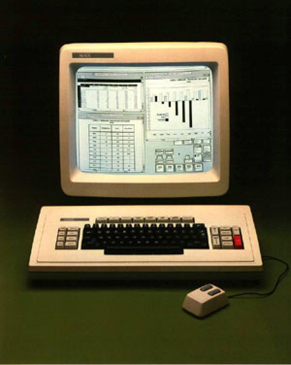
That same year, in 1981, Xerox finally brought a machine based on the PARC technology to market. It was called the Xerox Star,[13] and it was a failure. Technically, it was woefully underpowered, slow, and overpriced. Hesitant and inept marketing did not help matters. Many of the developers, sensing more willingness from Apple and other emerging PC companies to push the technology, had started to bail out of PARC in 1980; the failure of the Star accelerated the process. Xerox, despite having pioneered the GUI and several of the other key technologies of modern computing, never turned a profit from them.
Figure 2.7. Screen shot from a Star (1981).
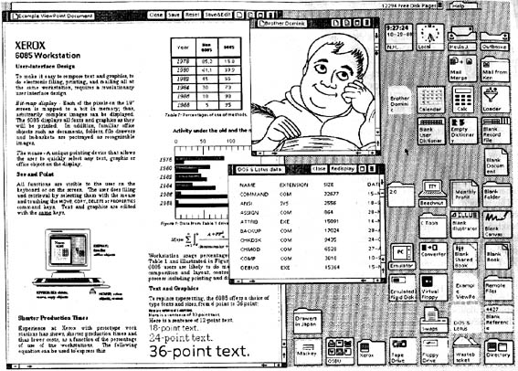
The Star interface pioneered the desktop metaphor that would be ubiquitous in later GUIs.
The third key event of 1981 was the first IBM personal computer. This did not advance the state of the art in GUIs — in fact, the original PC-1 had graphics capability available only as an extra-cost option, and no mouse. Its slow 8088 microprocessor could not have supported a PARC-style GUI even if the will and the design skill had been there to produce one. Even then, however, it was obvious that IBM's entry into the market would eventually change everything.
Earlier PCs from Altair, Apple and elsewhere had been even more underpowered and crude than the IBM PC. [14] The earliest, like the Altair, harked back to pre-1960 mainframes, requiring programs to be read from paper tape or toggled in on front-panel switches. The next milestone in the evolution of the GUI was actually to come out of the Unix world.
That next milestone was the 1982 release of the first Sun Microsystems computer, yet another mating of Unix with an Alto-inspired hardware design. This one, however, would prove immensely more successful than the Perq or Blit. In fact it set the pattern for one of the most successful product categories in the history of the computer industry — what became known within a few years as the technical workstation.
Workstations were Unix machines with high-resolution bit-mapped displays and built-in Ethernet. Early in the workstation era most were designed to use the Motorola 68000 and its successors; later on they tended to be built around various 32- and 64-bit processors at a time when PC hardware was still struggling to transition from 8 to 16. Workstations were designed (like the Alto) to be deployed as single-user machines on a local area network, but (again like the Alto) they were too expensive for individuals to own and were never marketed that way; instead they tended to be deployed in flocks, and the only way to get the use of one was to be a knowledge worker at a corporation or in academia. Three of their largest markets were software-development organizations, electronic design and CAD/CAM shops, and financial-services firms.
The Sun workstations and their imitators added very little to the GUI design pattern set at PARC; slightly glossier screen widgets with pseudo-beveled edges were nearly the extent of the visible additions. Their success came from layering the PARC look-and-feel over a software platform, Unix, that was already familiar to many engineers and development shops. Within five years the combination of GUI and command-line interfaces supported by workstations effectively wiped out traditional minicomputers and their staid command-line-only interfaces. It would be nearly a decade before Sun's machines were seriously challenged for their leading role in the computer industry.
All through that decade Suns remained very expensive machines. There were a few attempts to scale down the workstation to a price where it would compete with PCs for individual buyers; perhaps the least unsuccessful was the AT&T 3B1 (aka “Unix PC”), a 68010-based machine available c.1984 with a pixel-addressable black-and-white display running a custom Alto-like window system. The 3B1 attracted a small but loyal fan base as a personal machine for Unix programmers, but it was in an awkward spot on the price/performance curve; too expensive for the home market, not powerful enough to compete as a full-fledged workstation. It lasted barely three years before being plowed under by steadily more powerful PC-class machines with monitors that could not match the 3B1's screen resolution but could do color.
The 3B1's demise took the concept of the personal workstation down with it; nothing similar was ever attempted afterwards, and the initiative in Alto-style interfaces once again passed out of the Unix world. Thus, the really pivotal 1984 event in the history of the GUI was when Apple released the Macintosh and brought the Alto-style graphical user interface to the masses.
Perhaps it should have been the Amiga, designed in 1983 but released only after the Mac in 1985. The Amiga followed the PARC GUI model, if perhaps less inventively than the Macintosh. Its designers at the original Amiga Inc. wrung remarkably effective graphics performance out of weak hardware, and the machine rapidly attracted a cult following after release. But Commodore mismanaged and squandered the opportunity after they acquired the Amiga development team. Delayed and underfunded development, anemic marketing, over-expensive followon machines, bad strategic decisions and a bruising price war with Atari dogged the Amiga, but the technology was so attractive that it actually survived the IBM PC, the Macintosh, and the 1994 bankruptcy of Commodore. For nearly a decade afterwards the Amiga retained a niche in video mixing and production. The design was revived at least twice, and as late as 2003 German-made Amiga clones were still available in Europe.[15]
Figure 2.8. Kickstart on the Amiga 1000 (1985).
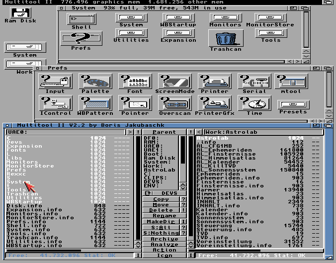
This is as good as the resolution of color monitors got in 1985 — no better than 640x256, not good enough to render fonts with the clarity of the black-and-white displays on the Star or Macintosh.
Apple did not squander its opportunity. Part of what made the first Macintosh a pivotal event was that Apple did not merely copy the PARC pattern; they reinvented and improved it. The development took five years, an eon by industry standards, and involved deeper investigation of interface psychology and design than anyone had ever attempted before. Apple successfully claimed the leading role in carrying forward the PARC-style GUI. Two decades later, the Apple Human Interface Guidelines[16] are still recommended reading for anyone who wants to do graphical user interfaces well.
Figure 2.9. Early version of the Macintosh Finder (1985).
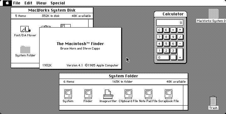
Compare this with the Amiga screenshot from the same year to see the dramatic difference between the quality of black and white vs. color displays in the 1980s..
Technically, the Amiga and Macintosh shared one major limitation with a subtle but important impact on UI design: unlike the PARC designs or any Unix machine, they supported only cooperative rather than preemptive multitasking. That is, they were not equipped to timeslice among any number of concurrent user and system processes; rather, a program had to give up control of the processor before any other program (even the system routines) could take over.
Cooperative multitasking was an economy measure. It meant the hardware platform could omit an expensive MMU (memory-management unit) from its parts list. On the other hand, it meant that the latency of interfaces was minimal and constant, never disturbed by random interrupts or scheduler-introduced jitter. This made for a smooth, predictable user experience even on relatively underpowered hardware. On the third hand, the absence of preemption turned into a serious liability as computers became more and more networked. It was literally the case that an entire network of Apple machines could be frozen by a user holding down a shift key at the wrong time!
Despite this weakness, the Macintosh had an even larger impact on user-interface design than had the Alto, because it was not dismissable as a mere laboratory toy but rather a very successful consumer product. GUIs, it proved, could sell computers to the mass market. Microsoft and others in the personal-computer market scrambled to adapt.
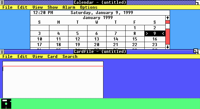
Microsoft's early attempts at a PARC-like GUI began with the 1985 release of Windows 1.0. Early versions were ugly and unsuccessful, garishly colorized but weak efforts to clone the PARC GUI that didn't support even such basic features as overlapping windows; they largely failed to displace Microsoft's own DOS product. Microsoft's time was not yet.
[10] A good description can be found at the Bletchley Park Computer Museum in England; though produced in Pittsburgh, the Perq was apparently most successful at British universities.
[12] The story of the name change is humorously told in the AT&T 5620 (and Related Terminals) Frequently Asked Questions document, from which the Blit-Related material in this history is largely derived.
[13] A discussion of the Xerox Star explaining some of its design choices is available as The Xerox "Star": A Retrospective.
[14] For an entertaining look at early personal computers, see the Blinkenlights Archeological Institute
[15] There is a good resource on the history of the Amiga at The Amiga History Guide
